Product design and frontend · Digital platform
Turning 796 hospital websites into one place to find care
How AdventHealth unified hundreds of separate sites across 1,200 facilities into a single platform, where patients can find a doctor and book a real appointment in minutes.
jump to the solutionThe challenge
Hundreds of sites, none of them speaking the same language
Across 1,200 facilities, AdventHealth had grown into nearly 800 separate websites, each with its own look, navigation and content. For a patient trying to find a doctor or book a visit, the experience changed every time they clicked.
The goal was a single, consumer-first platform that unified all of it, consistent, searchable and bookable, while giving internal teams a system they could extend without rebuilding from scratch. I owned design for the find-care and scheduling experiences at the heart of it, and built the components they run on.
The core problem
Patients did not want a website. They wanted an appointment.
The old sites were built around the organisation, by facility, by department, by brand. But a patient does not think in org charts. They arrive with a need: find someone who treats this, nearby, who can see me soon.
My job was to design around that intent: a clear path from "I need care" to a booked appointment, that worked the same way no matter which of the 1,200 facilities a patient landed on.
Design principle: organise around the patient's need, not the hospital's structure.
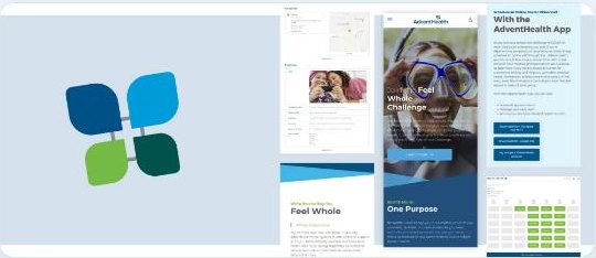
Ideation and information architecture
Designing one path from need to booked visit
Rather than recreate hundreds of site structures, I worked with the team to define a single spine every patient could follow. We mapped the real decision a patient makes and built the architecture around those steps, so the same flow held across every facility and service line.
Wireframing
Testing the find-and-book flow in low fidelity first
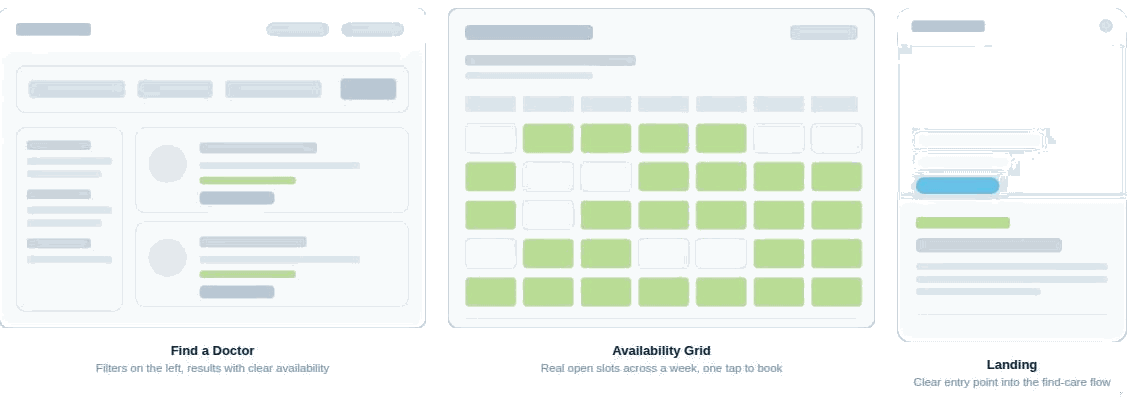
I wireframed the three highest-stakes screens before any visual design: search with filters, the availability grid, and the consumer landing page. The aim was to prove the flow held together, that a patient could move from search to a booked slot without a dead end, before investing in high fidelity.
The work
Find a doctor, filter with intent, see real availability
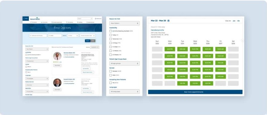
The find-care experience was the core of the platform and the part I owned. Search by condition or specialty, then narrow by the things patients actually care about, distance, soonest availability, insurance, gender, language, and see genuine open appointment times rendered right in the results.
The hard part
Real availability is a promise, and promises break
Deciding to show real open times, rather than a request form, was the decision the whole platform rested on. It is also the one that can fail in public. A slot is only true until somebody else takes it, and the grid had to hold thousands of them across 1,200 facilities and several time zones without ever offering a patient something that was already gone.
Slots were fetched per provider and per week rather than in one giant payload, so the grid could render the visible week fast and refetch quietly on focus. A stale slot is worse than a slow one.
Selecting a slot optimistically locked it in the interface while the request went out, with a clear recovery path when the server said it had just been taken. That failure is common enough that it needed a designed state, not an alert.
Every state a patient can hit had a designed answer: no availability this week, no provider matching the filters, insurance not accepted, appointment type unavailable at this location. On a booking flow, the empty states are the product.
Filter state lived in the URL, so a filtered search could be shared, bookmarked, reopened, and indexed. On a platform replacing 796 sites, search visibility was not optional.
A closer look
One consumer experience, from wellness to video visit
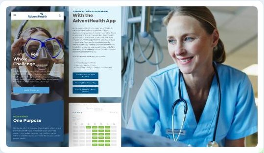
Beyond find-a-doctor, the platform had to carry everything from wellness campaigns to scheduling a video visit, all in one voice. I extended the same patterns across these surfaces so the experience felt like one product, not a stitched-together set of pages.
Designing on a shared component system meant every new page extended the platform rather than fragmenting it again.
Impact
One platform, one experience, hundreds of sites retired
The unified platform replaced nearly 800 separate websites across 1,200 facilities with a single consumer-first experience, real provider search, real-time booking, and a component system that let teams launch new pages in weeks instead of months.
What I took away
Unifying a sprawling system is less about visual polish and more about finding the one shape the whole thing can share. The hardest and most valuable work was designing a single find-and-book flow flexible enough to hold across 1,200 facilities, then trusting the component system to carry it everywhere. It taught me to design the pattern, not just the page, which is the same instinct behind the component library I build now.
Public project metrics and scope are based on the published AdventHealth digital platform case study. Screens shown are from project materials.