Product design · Concept
Making long podcasts searchable
You heard a two minute story from a three hour episode. Finding it again should not mean listening to the whole thing.
jump to the solutionThe problem
Inefficient podcast discovery
Podcast listeners struggle to find specific content inside lengthy episodes, or to judge quickly whether an episode is worth committing to at all. The result is frustration and abandoned listening.
Social proof
The behaviour was already there, the tooling was not
Job to be done: enable podcast listeners to explore content in a time-efficient and personalised way.
Approach
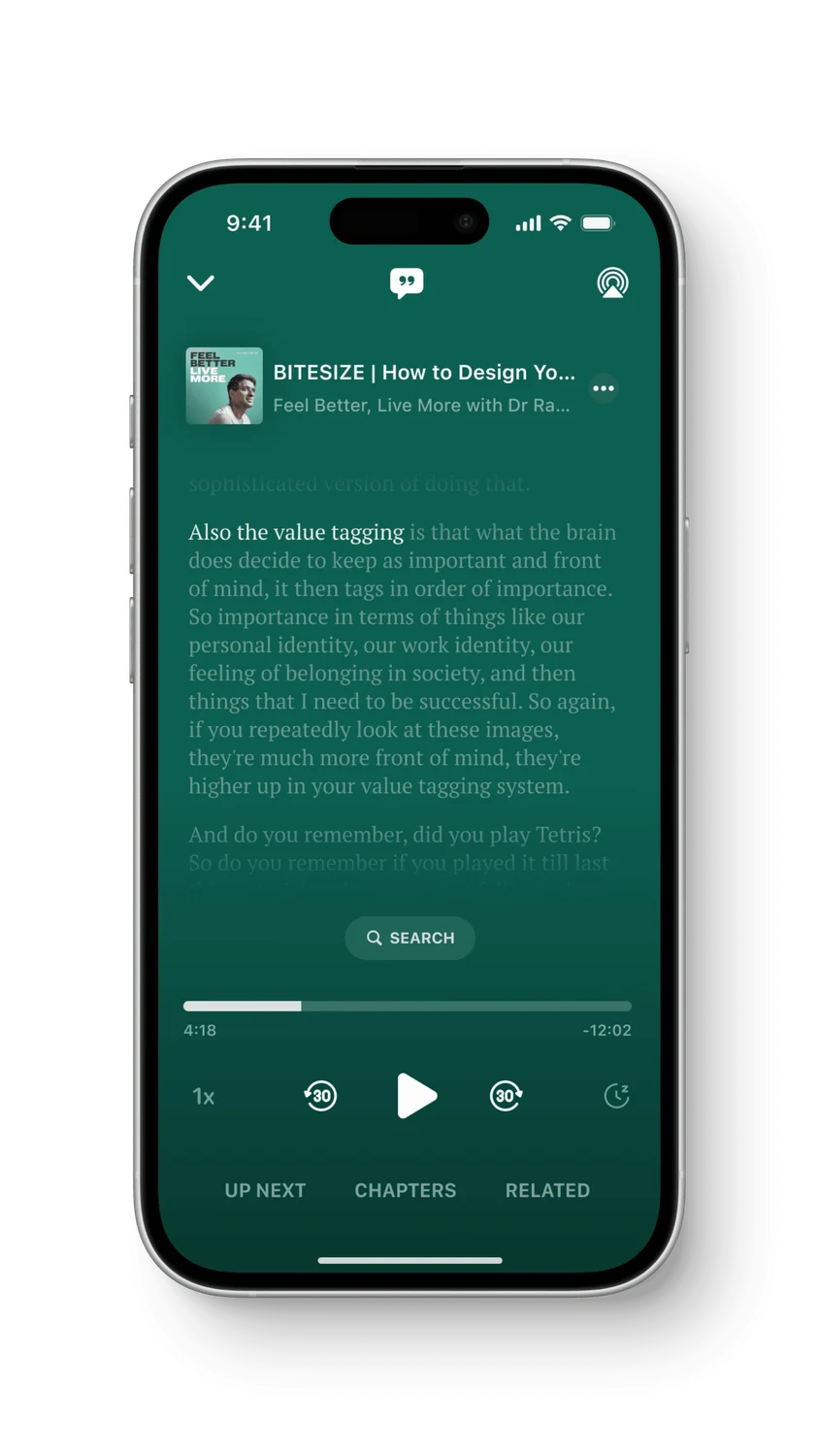
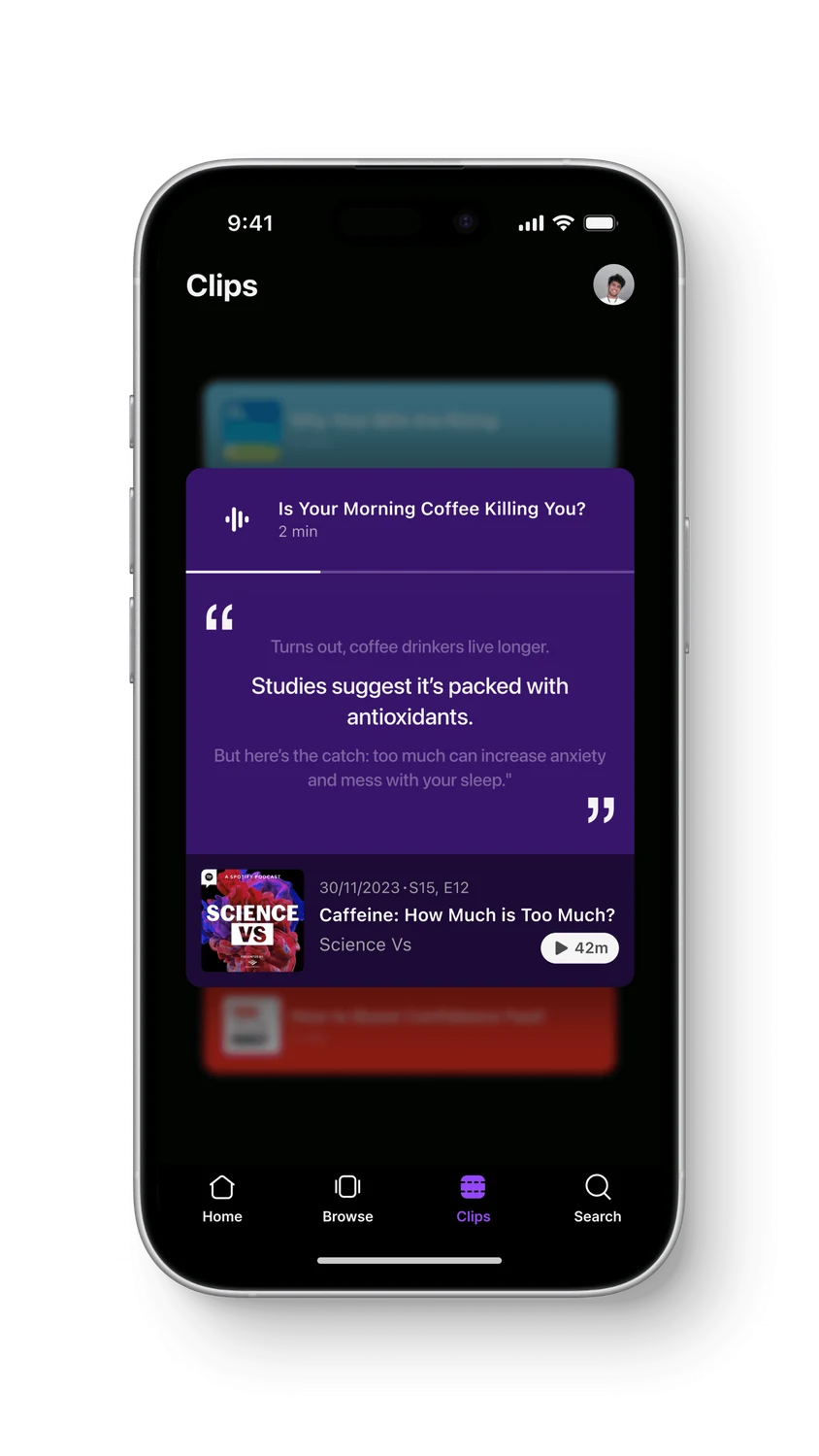
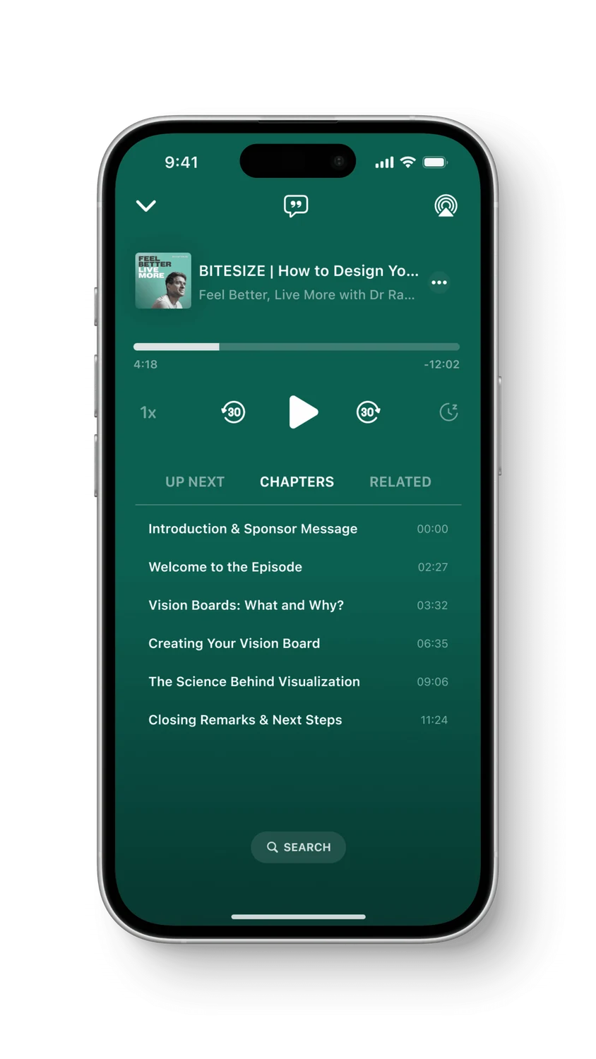
Three capabilities, and a long episode stops being one block
The whole idea rests on treating an episode as addressable rather than linear. Three features do that, and each one answers a different reason a listener gives up: they cannot find a part they half-remember, they cannot tell if the episode is worth an hour, and they cannot skip to the subject they came for.
Primary user flow
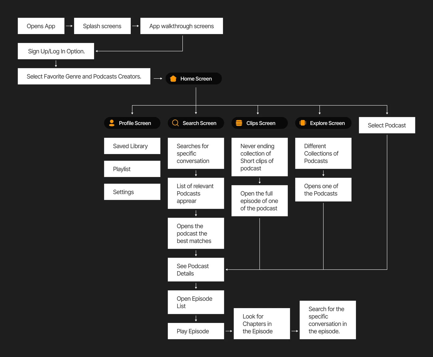
Every capability one step from home
Before any visual work I mapped the flow end to end. The test was simple: if a feature could not be reached from the home screen in one move, it would not get used, because the listener who needs it does not yet know it exists.
Wireframing
Settling structure before surface
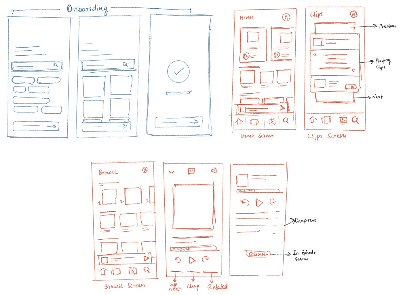
Early wireframes tested layout and hierarchy across onboarding, home, the episode view and the clip. They went through several rounds, and the question at every round was whether the structure still held without colour or type doing the work.
Visual design ideation
Five clip cards, tested rather than argued about
The clip card carries the entire sampling idea, and it has four jobs competing for one small surface: the pulled quote, which episode it came from, how long the full thing is, and the way in. I built five directions and put them in front of users rather than picking the one I liked.
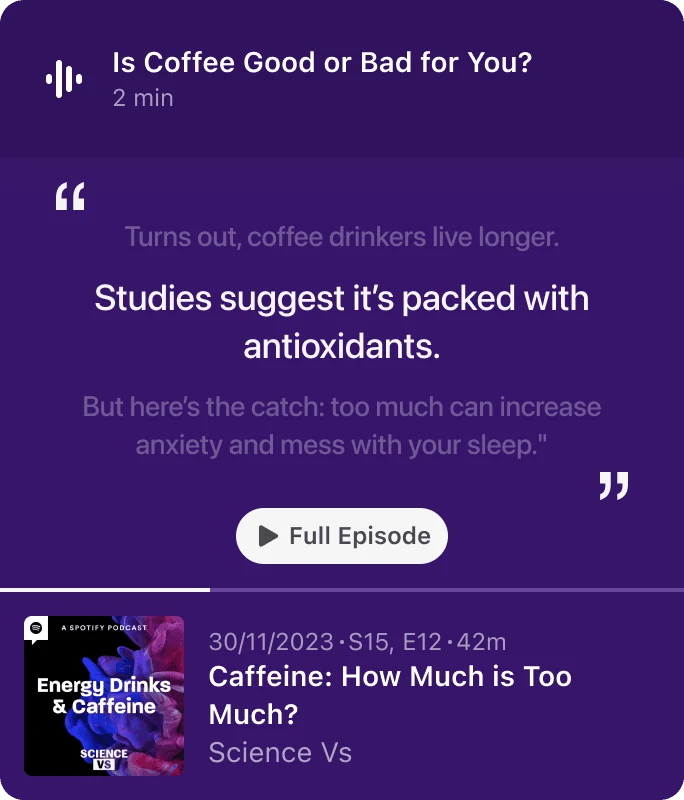
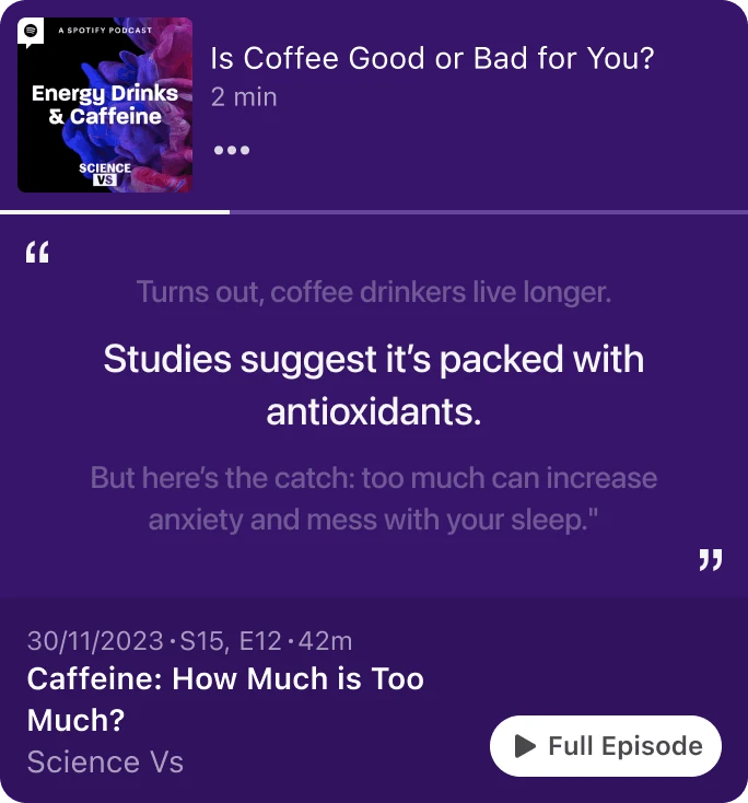
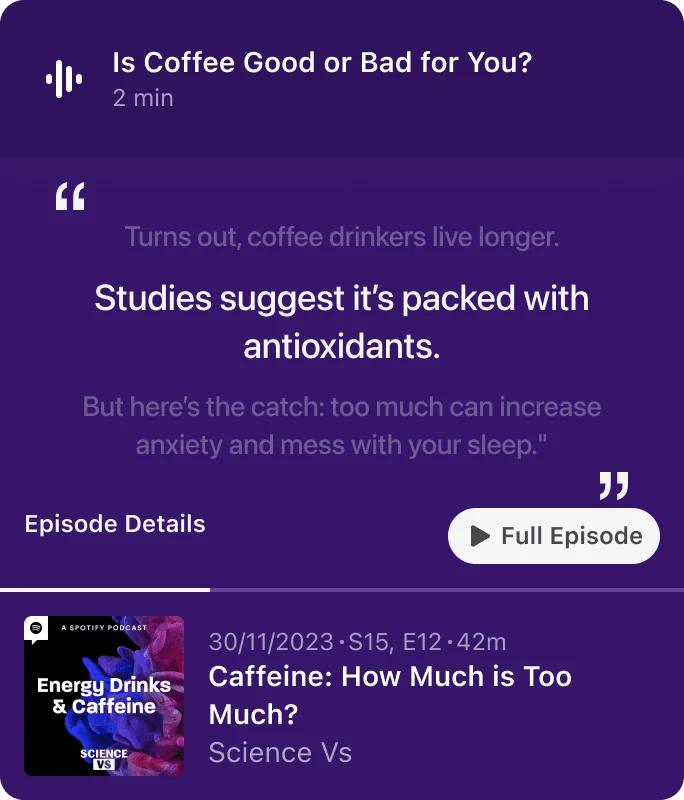
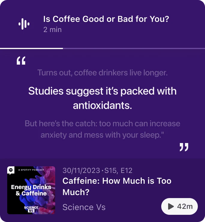
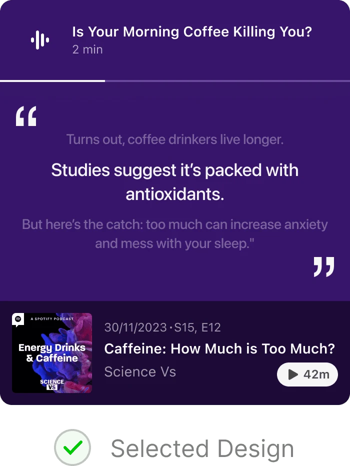
The winner is not the prettiest of the five. It is the one where a listener could tell, without reading, which part was the quote and which part was the podcast.
Final prototype
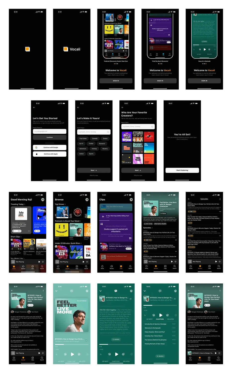
The system, end to end
Onboarding, browse, clips, search, player and profile, built out as a working high fidelity prototype. One dark ground, one accent, and type carrying the hierarchy, so the artwork inside a clip is the only colour competing for attention.
The mark came last and deliberately stayed crude: an ear and a drip, drawn in one weight so it survives at sixteen pixels.
Audio products tend to reach for waveforms. A waveform says sound. It does not say that this one is about pulling something out of a longer thing, which is the only claim the product actually makes.
Reflection
What this project taught me
Vocali was the first time I designed an interface whose core value came from a machine reading the content, generating clips, segmenting topics, making audio searchable. The design question was not what the model could do. It was how much of its output a listener should be shown, and how confident the interface should sound about it.
That question, how to present generated results honestly, with clear handling for loading, empty and wrong, turned out to be the same one I now work on every day in agent interfaces. Vocali is where I first hit it.