Product design and frontend · Patient portal
Merging 3 hospital record systems into 1 patient portal
How AdventHealth moved 250,000 patients onto a single health record across web, iOS and Android, without anyone losing access mid-migration.
jump to the solutionThe challenge
Three record systems, one experience, zero room for error
After a system-wide rebrand, AdventHealth needed to move its entire patient portal onto Epic, the largest electronic health record platform in the US, while three legacy systems (NextGen, Cerner, Athena) were still live.
The hard part was continuity. Patients had to keep reaching their records, bills and appointments throughout a multi-year, region by region cutover. I worked inside the AdventHealth team alongside the agency, owning design for the patient-facing flows where data from different systems had to feel like one product, and building the frontend components those flows ran on.
The core problem
A patient does not care which system their data lives in
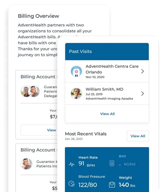
Behind the portal, a single patient's records could be split across multiple record systems, with duplicate entries, overlapping appointments, and bills grouped differently in each one.
My job was to hide that complexity. The design had to present one clear timeline of visits, one consolidated set of bills, and one accurate record, even while the data underneath was being de-duplicated and migrated.
Design principle: the patient should never see the seams between systems.
Ideation and information architecture
Reducing a sprawling portal to four jobs
Early on, the portal risked becoming a dumping ground, every feature the three legacy systems offered, bolted together. Before designing screens, I worked with product owners to map what patients actually came to do, and collapsed dozens of scattered entry points into four core jobs that became the backbone of the information architecture.
Wireframing
Pressure-testing the structure in low fidelity first
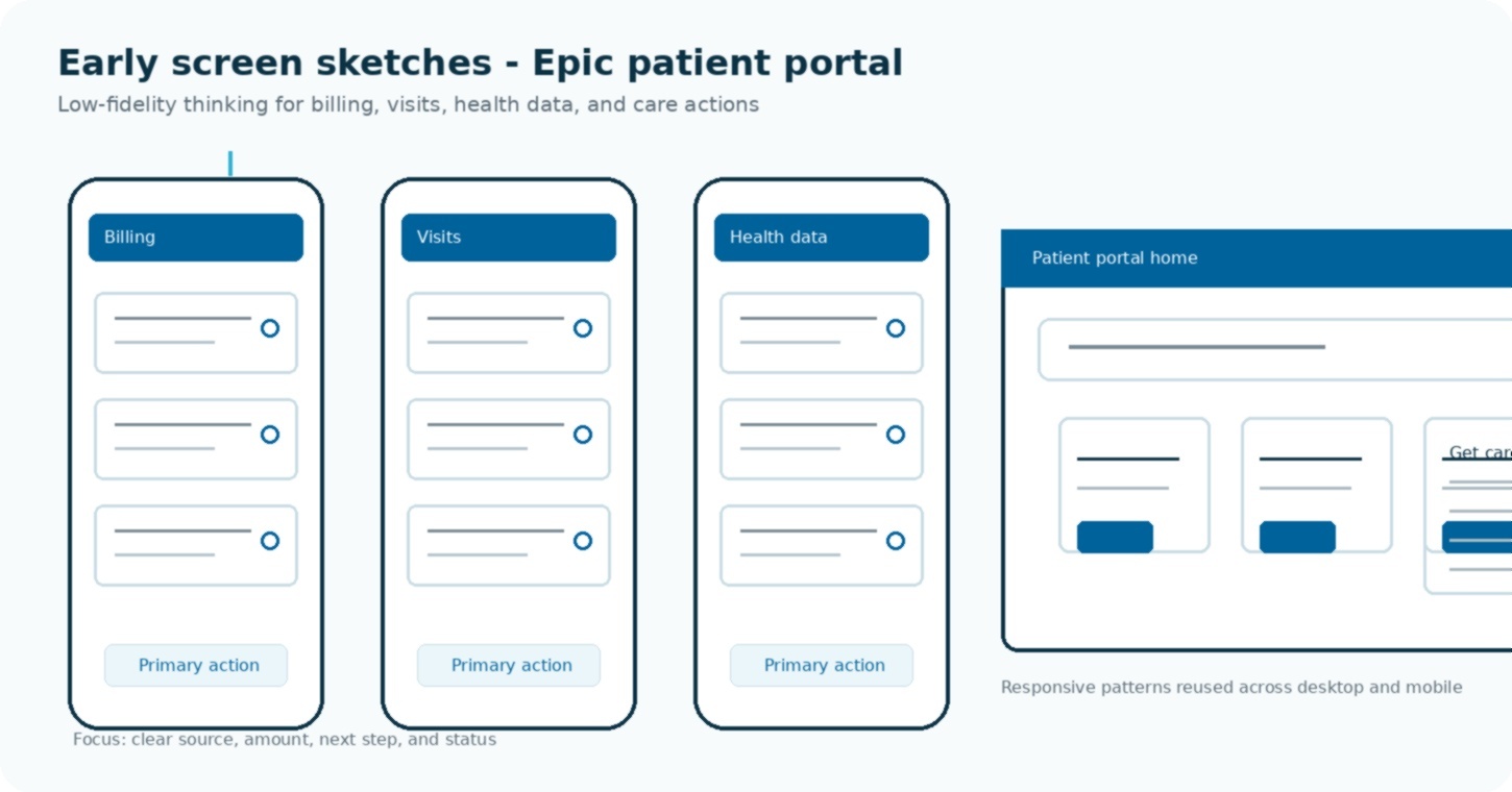
Before any visual design, I wireframed the highest-stakes flows to test hierarchy and confirm each screen worked with incomplete or still-syncing data. The goal was to settle structure cheaply, so high-fidelity design could focus on clarity and trust.
The approach
Design for backward compatibility first
Because regions cut over to Epic at different times, the portal had to run on all systems at once during the transition. Every screen had to render correctly whether a patient's data came from Epic or a legacy system, and surface the right data as regions switched over.
The hard decision
Decide once where the mess is allowed to live
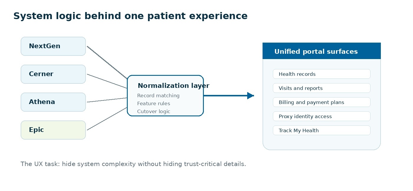
"Never show the seams" is easy to write on a slide and expensive to honour. The question it forces is where the messiness goes, because it does not disappear. Four systems described the same visit four different ways, and something had to reconcile them before a patient ever saw a screen.
The alternative was letting each screen cope: a visit card that knows it might be an Epic visit or a Cerner visit, and branches. That works for two screens and collapses at forty, because every new feature has to relearn the same four dialects and every designer has to hold them in their head.
So we pushed reconciliation down to a single boundary. Above it, one shape of a visit, one shape of a bill, one patient. Below it, all the record matching and cutover rules. The design could then be about what a patient needs to see, not about which vendor happened to supply it.
This is the decision I point to when people ask what a designer who codes is actually for. It is an architecture choice, and it was made to protect a design principle.
Forty features could not each invent their own layout. New work extended an existing pattern or it did not ship, which is the only way a product this wide stays recognisable to the person using it.
Mid-migration data is rarely clean. Loading, partially synced, missing, duplicated and permission-restricted each got their own treatment, because a blank field in a health record reads as alarming rather than merely absent.
Web, iOS and Android shipped in parallel with different teams. Shared patterns and one source of truth for layout kept them from drifting into three products with the same logo.
Contrast, focus order, tap targets and keyboard behaviour verified against WCAG 2.1 AA during design QA, on flows where a misread number is a safety problem rather than an inconvenience.
The work
40+ features, designed to feel like one product
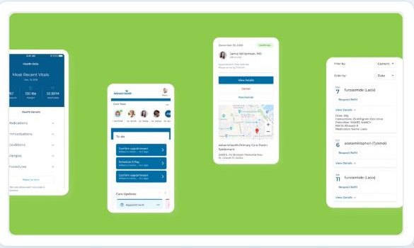
I designed and built flows across the portal's core jobs: consolidated health data, care-team management, appointment confirm and reschedule, and medication refills.
Each had to handle the messy reality underneath, missing fields, data still syncing, records from different sources, with clear states so patients always knew what was current.
A closer look
Making the next step obvious, whatever the need
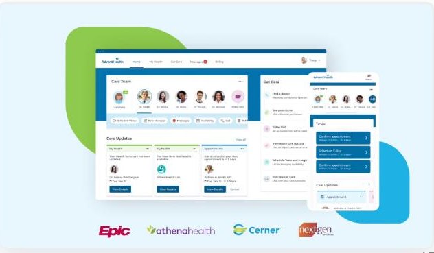
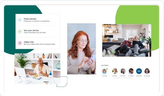
"Get Care" was the portal's front door for action. The challenge was reducing a sprawling set of options, find a doctor, see a provider, start a video visit, schedule tests, into a few clear, confident entry points.
I designed these as a simple decision layer with strong visual hierarchy, then carried the same pattern across web and mobile for consistency.
Working within an established design system meant every new feature extended existing patterns rather than reinventing them.
Working at scale
Design across 20 business units, six product owners, one system
This was a program, not a project. Designing inside it meant keeping patient-facing flows consistent while engineering rewired the data layer underneath, across a multi-year, region by region rollout.
Impact
A portal that held together through a multi-year migration
The redesigned portal launched across AdventHealth's regions on a rolling, two-year timeline, giving 250,000 patients continuous access to records, billing and appointments while three legacy systems consolidated into Epic behind the scenes. Behavioural data from more than 50,000 sessions fed back into onboarding, which is how the first-run experience got shorter with each regional wave rather than staying frozen at whatever we guessed in year one.
What I took away
The hardest problems here were invisible to the patient by design. Working at the scale of a live migration taught me that in regulated, high-stakes systems the best design decision is often the one that makes complexity disappear: clear states, consistent patterns, and a single source of truth the user can trust. It also taught me that a principle like "hide the seams" is a frontend commitment as much as a design one. Designing for data that is mid-migration is a discipline I now carry into every data-heavy product, including the agent interfaces I build today.
Public project metrics and scope are based on the published AdventHealth Epic case study. Screens shown are from project materials.